Label
Image Evidence
Design Process
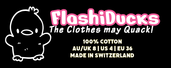
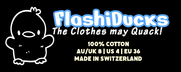
The Design process of my label started off with looking for inspiration from different sources such as other design brands. Since most of the luxury/modern clothing brands had a mainly minimalistic and simple design, I also decided to take a similar approach though my brand is a sleep wear brand. My first logo design was Logo Design 3 which has a duck icon and my brand name overlapping on it. It has a faded green background with pink blending in on the top right corner. Since this design had the brand name overlapping it make it kind of had to read, so that’s why I created Logo Design 2 which put the duck icon on the centre and put the brand name going straight through it and make sure to give it an outline, so it was more readable. The background colour also changed to a blue centre fading into a pink outer, the text colour also changed form black to white for more visibility. My third design, Logo Design 3 which is my chosen design also included the tag line, “The Clothes may Quack!” This tag line is mainly added just to ad some more fun to the brand, this design approach also has the duck icon. The tag line is placed in a small font right under the icon. This time the brand name was shaped into an arch and placed under the icon and tag line. The icon, tag line and brand name has a black colour while the background has a faded blue form the right to a pink towards the left, the colours are kept light to keep the text and icon visible. The neck tags feature my brand icon on the far left, it has the brand name next to it at the top with the tag line directly under it. My neck tag clearly shows the composition of what materials it is made of, country which it is made in, and the clothing size in 4 different standards so people all over the world would be able to identify it easily. All the text and icons are in white with the brand name having an outline, pink for feminine clothing and blue for masculine clothing. The background is black so it can be easily spotted under the collar.
Design Choices
I designed it the way I did because it is similar to many other fashionable clothing brands logos and I personally like this minimalistic light style. I chose this font because it modern and easy to read, and for sleepwear which my brand will mainly focus on, simple and comfortable clothing is the best. My icon is a duck because it is my favourite animal and many other people class it as a cosy animal which fits the main brand idea. Light colours were chosen to keep the logo relaxing.
Design Platform
The platform I used to design my Logo and Neck tag was Adobe (Online), because unlike Canva everything is not behind a premium, and is provided free by the school.
How It Represents Me
Yes, my label does represent me. My favourite animal is the humble yellow duck, and the main icon on my logo is a duck outline. I also prefer simple minimalistic designs which aren’t too bright nor too dark.